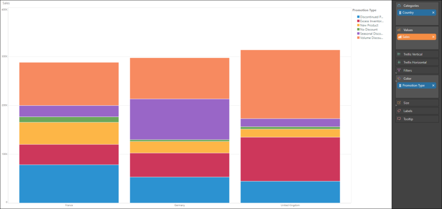
The Stacked Column Chart displays accumulated series values based on ABSOLUTE totals. One member hierarchy is represented on the x-axis, and a second member hierarchy drives the color of the chart. Each column on the x-axis is divided according the second hierarchy that drives the color; the colors represent the member elements in this hierarchy. The segment height within the columns is driven by the measure in the Values zone.
Note. To learn how to make a stacked measure chart, with each column showing multiple measures, click here.
Build a Stacked Column Chart
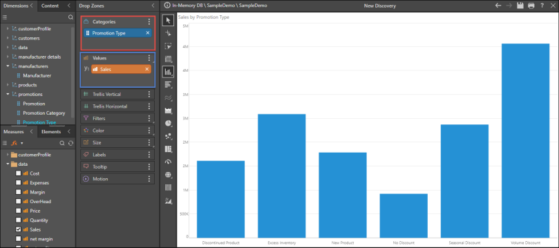
Step 1
Add the hierarchy that should sit on the x-axis to the Categories zone (red highlight below), and add the required measure to the Values zone (blue highlight below).
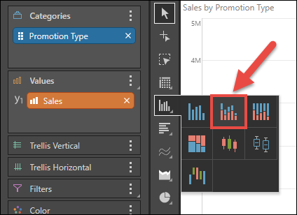
Step 2
From the Column Chart fly-out menu, select the Stacked Column Chart.
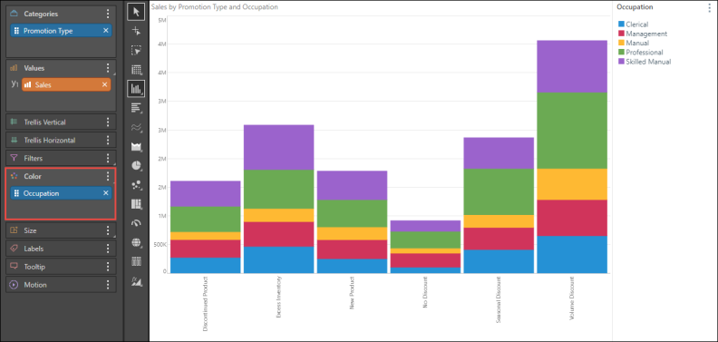
Step 3
Add a second member hierarchy to the Color zone (red highlight below).
NOTE: You can add data labels to the chart - either a total for each color, or an overall total for the column. For more information, see Data Labels.